Healthcare / Service redesign
Familiarity breeds content
By Andrew Sansom | 25 Apr 2016 | 0
The patient is gradually becoming the focal point around whom myriad health services, technology and staff are interacting, while a stronger emphasis on designing hospitals to create familiar public and urban space promises a more humanistic approach to care.
Sprawling yet understated in its relationship with the city, Le Corbusier’s Venice Hospital never saw the light of day, but his vision of how a hospital might be weaved into the fabric of the urban environment is still held up as one of the earliest examples of patient-centred design.
Aided by the popularity of the automobile, the principle of locating hospitals away from urban hubs and designing them as sealed structures helped solidify the prevailing postwar concept of separating the healthy and the ill.
Le Corbusier’s design, created in 1964, jarred with this notion. He wanted the hospital’s lower level to act as a continuation of Venice’s public space, by mirroring the city’s semi-autonomous islands and campi (Venetian squares), separated by channels and connected by bridges. The city’s spatial hierarchy – from public to semi-private to private – would be upheld, with ambulatory services at the edge and clinical areas in an inner zone.
With demographic change and economic pull bringing growth to cities worldwide, healthcare has to re-forge its relationship with the urban environment at the same time as medical services are shipped out to the community. The closer links between urban planning and hospital design are seen as a means to support patient-centred care, while they may also support a shift towards health prevention and promotion.
New Hauner Children’s Hospital in Munich is an attempt to create a similar atmosphere of a semi-public city neighbourhood. “You start very public and, as you go into the building, it becomes more and more private,” says architect Christine Nickl-Weller. “It’s a good idea to create a place that we already know, not only for orientation but also to maintain a system of hierarchy.”
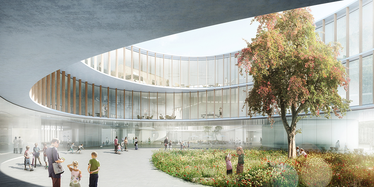
Soft, round courtyards, each with their own individual form and surrounding interior environments, break up the building. These areas are easily recognisable to support orientation, and are flooded with natural light.
Converging estate
The desire to weave hospitals into urban surroundings rather than constructing standalone landmarks partly reflects the increasing convergence of health estate, with specialist ‘super’ hospitals and co-location of related services delivering patient-centred care.
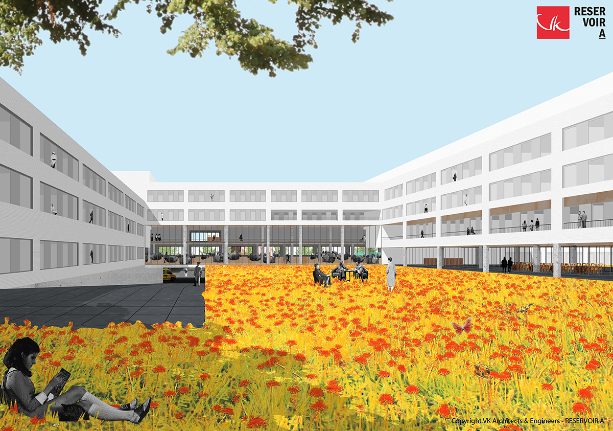
In Belgium, these trends are evident in the work of VK Architects & Engineers, whose design for the 1000-bed Grand Hospital of Charleroi, for example, has emerged from fusing five outdated hospital campuses, and is part of a wider agenda to re-engineer the city according to a new sustainable vision. In VK’s design of a new hospital in Roeselare, co-location of services is envisaged by grouping nine pathology clusters in six ‘poles’. The polyclinic, nursing units and day clinic are grouped architecturally according to ‘pole’, resulting in a patient and staff-oriented design with designated care floors.
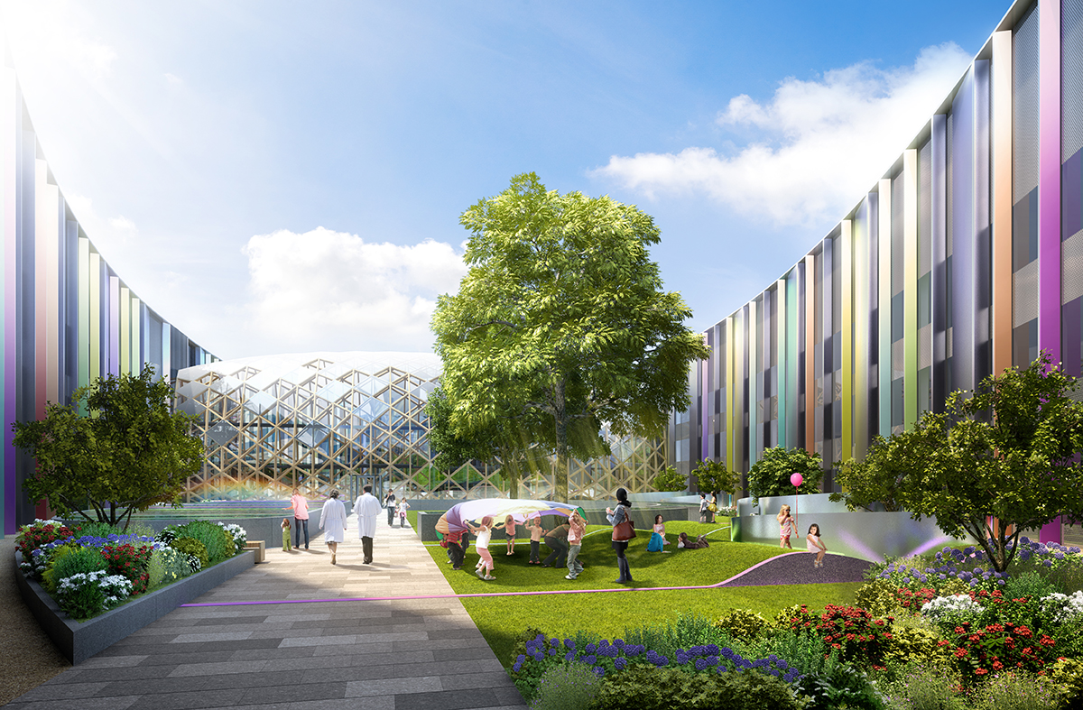
 These trends are also seen as a way to soften large structures and humanise healthcare. Conceived along similar lines to the New Hauner, the National Paediatric Hospital in Dublin, Ireland will see children’s and maternity services brought together on the same site as the existing adult hospital. Set for completion by 2020, the hospital will act as a secondary care hospital for people living in and around Dublin, and as a tertiary and quarternary hospital for referring people across Ireland (including Northern Ireland) to specialisms.
Describing the need to break down the hospital’s scale, lead architect Benedict Zucchi, from BDP, explains: “We see this as fundamental to making the hospital more accessible to children – playing with their sense of scale and curiosity. This is also a key consideration in townscape terms, ensuring that the hospital is successfully embedded in its context alongside residential-scale buildings.”
Wayfinding is aided by the ‘campus’ design, which he describes as “a sequence of individual ‘buildings’ connected by day-lit or external spaces that provide an engaging public realm, enlivened by shared amenities, art installations, gardens and so on – just like the best city spaces”.
By opening up hospitals, there is room for design concepts from other fields to influence the form and feel of buildings. Another of Zucchi’s projects, Alder Hey Children’s Hospital, in Liverpool, reflects this cross-fertilisation.
He remarks: “Integration of the multi-storey car park and the immediacy of its relationship to the atrium concourse provide the level of convenience and legibility of wayfinding normally associated with a shopping centre.
“The ‘playdecks’ at the end of the ward fingers are the most obvious cousin of our lineage of urban schools (most notably Hampden Gurney and Devonshire primary schools), giving inpatients access to the outdoors and sensational park views from every level.”
 De-stressing the environment
For John Cole, chair of the design committee for Dublin’s National Paediatric Hospital, there has been too much focus on defining architecture by how it looks rather than how it feels. In an era when healthcare staff are expected to work more flexible hours and more closely with other healthcare disciplines, more attention must be paid to staff’s emotional response to healthcare infrastructure, in order to help them adapt to new demands. The new hospital in Dublin will have open office accommodation and hub areas in outpatient clinics, where different healthcare disciplines can come together and support one another. But, rather than building lots of meeting rooms for communication, Cole sees the issue more in de-stressing the environment to aid wellbeing.
“In most health technical memorandums, the allocation of space becomes almost a tyranny,” laments Cole. “Actually, creating breathing space can make buildings feel completely different in how people respond. If a clinician is in a better mood because of their surroundings, they’ll probably say something nice to the patient as opposed to being gruff. Maybe that nice remark brings the patient’s blood pressure down. All these things collectively, and over time, can have a huge impact.”
Nickl-Weller echoes Cole’s sentiment, pointing out that because people nowadays have multiple diseases they’re constantly going in and out of hospital for appointments with different consultants.
“We have to design hospitals where workflow is such that it is usual for people to meet,” she added. “We should be looking at examples of office layouts, where rooms used to be very defined but are now designed in a more flexible way, so you can do different types of work in them. That way we can build better and more flexible spaces, but we don’t necessarily need more space.”
Connection for care
Space is also key to the design of Stockholm’s New Karolinska Solna (NKS), which will be more condensed than the current building. Close links will be created between the reception, care units, imaging and laboratories. Likewise, effective transportation and logistics will be forged between the care and research facilities, both within the New Karolinska University Hospital and to the Karolinska Institutet.
Anna Montgomery from White Architects, which designed the project with Tengbom, highlights how there are “34 operating theatres spread across two floors so it’s flexible and easy to team up, with both horizontal and vertical connection”. Similarly, imaging and function units will be deployed at several locations in the building. Equipment will be tailored to the diagnoses that are treated at nearby wards, ensuring that examinations can be conducted quickly and reducing the need to move patients.
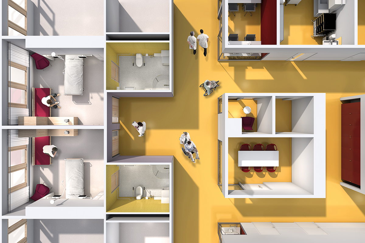 The design and size of patient bedrooms – all of which are single bed – will allow medical staff to work in teams at a patient’s bedside. It will also provide opportunities to conduct studies for research and educational purposes.
“With single patient rooms you don’t have to receive your care by going to a special room – you can stay in your room and the doctor can come to you,” says Montgomery. “The building is quite high and compact, because you don’t want staff to travel too far. You also have the flexibility of where you put the different wards to make it more integrated.”
This philosophy is similar to the approach at St Olav’s Hospital in Norway. The first public hospital in the country with single-rooms throughout, St Olav’s features wards redesigned into “sengetun” (bed clusters) to reduce walking distances and position staff closer to patients. The layout comprises an open urban block pattern, where bridges tie clinical centres together around a central plaza. The urban block pattern brings the public into the facility so the hospital becomes a ‘medical part of the town’.
In Denmark, which currently has 16 state-financed hospitals under construction, the principle of quality before proximity underlines the attention being paid to flexibility of the building and workforce. Christina Carlsen, a senior health advisor for the Danish Regions, explains: “The two main pre-conditions here are the implementation of a new concept for emergency care and the pre-hospital set-up.
“Since the technical, clinical and medical development continue to provide new opportunities for less invasive treatments, one-day surgery, etc, we’re facing a paradigm shift, so that patients should only be admitted to hospital if there are absolutely no other available or medically justifiable options.”
Reinvention the rule
While this shift takes place, however, general hospitals are faced with the challenge of trying to serve fewer but more acutely ill patients and, at the same time, reinventing themselves towards specialisms, updating their medical equipment and reducing their beds capacity.
In Germany, says Nickl-Weller, the government is providing investment for the renewal of hospitals, with those deemed more successful able to access cheaper funding. A typical route is for hospitals to merge so they become more specialised, and renewing facilities through private and public partnership.
She explains: “You might have a private polyclinic with a centre of doctors and a pharmacy and laboratory, and they rent the hospital’s operations rooms, beds, etc. The private sector is subsidising the public sector in a way, while the public sector is supplying facilities for doctors, who also benefit from new public hospitals. We need to lose around 20–25% of beds and this idea may enable us to renew hospitals.”
Understandably, reinvention requires a commitment to design flexibility, which can bring savings through reduced planning schedules. This has been evident at the NKS, the layout for which was only agreed last year despite construction having begun in 2010.
Montgomery believes the NKS offers lessons for other schemes: “If you can work with a flexible floorplan and a robust construction, you can wait for the layout plan for the ward and have the freedom to alter it later. The council in Stockholm (the client) realised that while healthcare may be changing rapidly the building doesn’t, and we don’t know what the layout should look like. So let’s build a flexible and robust building, and we can wait a few years for the layout.”
One cohesive health service
Also wrestling with these changes, Sweden’s neighbour Norway has attempted to bring some cohesion to its future healthcare estate planning by establishing the Norwegian Hospital Construction Agency, which acts as advisors or project managers depending on the size of a project. Says Marte Lauvsnes, a manager in the department of planning and development: “The Norwegian health minister has expectations about sharing experiences between projects, doing more standardisation, recycling solutions, etc – all of which is challenging because we’re developing both the buildings and the healthcare system. We’ll use evidence-based or knowledge-based planning, and our aim is to be a knowledge hub for hospital projects.”
 E-health and mobile health are widespread – if not wholly integrated – ingredients of Norway’s health system. Traditionally rolled out in rural communities, these will have a key role to play not only to act as the glue between patients, primary and community care, and specialist consultants but also because of the emergence of personalised medicine and self-care.
There is a lot of talk, too, about the need to have one health service, so you can deliver services for people before they come to hospital, and so they can take care of themselves at home.
“We’ve a lot of projects for people with lung diseases who can now take greater care of themselves at home. They’re using new technology and communicating with primary and specialised healthcare. Also, people with rheumatology are using systems to self-test and decide themselves when they need to visit the outpatient clinic for their next appointment.”
In Denmark, preventative health and health promotion is seen as much as a listening exercise for healthcare providers as an advising one. According to Carlsen, the ‘Our common healthcare system’ initiative was launched to improve the ability within Denmark’s healthcare system to listen to citizens’ knowledge, needs and preferences, in order to improve healthcare outcomes, experiences and quality of life.
She adds: “This also requires the active inclusion of citizens’ life situation and knowledge of their own health conditions. In that aspect, preventative health and health promotion – for which the municipalities are responsible – are key.”
John Cole is unconvinced that hospitals are appropriate settings for health promotion. “Getting the message out to people before they get ill is something that needs a whole new focus,” he says. “Some countries are trying to do something about this, but it doesn’t seem to be at a sufficiently significant input to make any fundamental changes.”
These messages may be better disseminated at grassroots level and supported by nudge-based behavioural change policies, where appropriate, rather than through top-down statements. A more agile community health estate, system and workforce, however, will be paramount in responding quickly to those people who don’t need to go to hospital, and to sustain the potency of the preventative health mantra.
Says Cole: “We haven’t looked sufficiently at the step-down function and moving people quickly through the system; can we have something in the community that is less expensive, rather than people lingering because there’s no one in the community to look after them and they can’t look after themselves properly?”
Recapturing humanity
The same agility applies to mental health, which Cole sees as one of the weakest areas of design. “A lot of new buildings are single room but, to some degree, we’ve lost the humanity in the design of these facilities,” he says.
While there is movement to address this by normalising mental health as any other physical health issue, integration is not without its challenges. Says Lauvsnes: “People with mental health problems often like to have wards on the ground floor, to have access to areas outside, to have privacy and areas where they can go without staff as well as be in a safe place. That may be contrary to how we tend to design for somatic care areas, where we have wards on the upper levels and outpatient clinics on the lower floors.”
“The other thing is the size of the facility,” adds Cole. “With mental health, people need individual treatments and need to feel cared for and supported.” He highlights Old See House in Northern Ireland, which features a combination of residential facilities for a maximum of eight people, who all have their individual rooms and a lounge, linked to outpatient and day facilities. The intention, informs 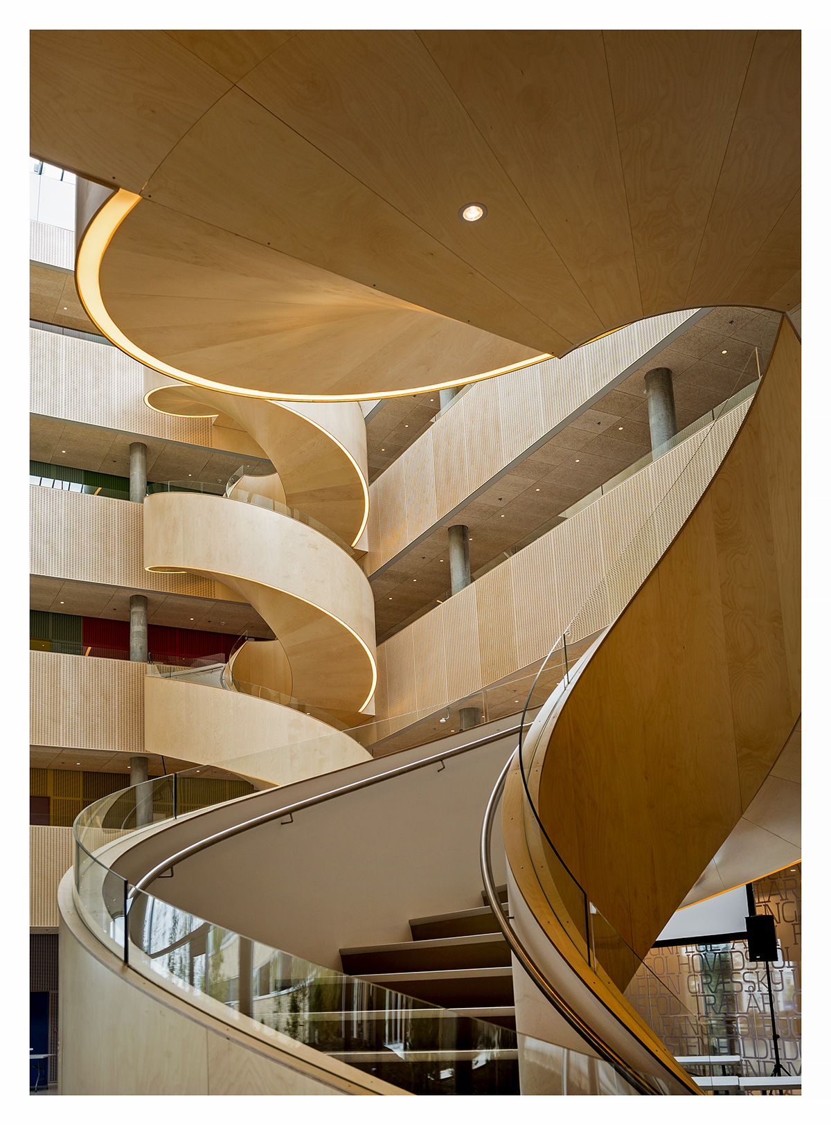 Cole, is to reduce inpatient admissions by managing them earlier, through crisis teams supporting them in the community.
Creating humanist architecture that prioritises people over design is a key principle behind Karlsson Arkitekter’s new 44,000 sqm psychiatric hospital in Slagelse, Denmark. The hospital is built on the notion that patients should feel recognised as equals, with the design mirroring the outside world.
“What’s special about this house is that its architecture adapts to the patient and reflects the recovery process that he or she is going through,” explains architect Christian Karlsson. “The design is diverse; some rooms are very modest while others are more challenging and eventful, resembling the outside world.”
Transparency between staff and patients is supported through extensive use of glass between rooms, as well as an open office area for staff. “You always know where to ask for help, and there are always people around you,” Karlsson says. “For the patient, it gives a feeling of being understood and that someone takes care of you. Staff, on the other hand, get better control of what’s going on.”
Feeling understood as part of a compassionate, cohesive and efficient health network is one of the key goals of patient-centred care. To increasingly stretched healthcare staff at the frontline and patients caught in the turbulence of disruptive change, this may seem a distant dream, but there are signs, particularly in the growing focus on urban integration and co-location of services, that a more efficient health ecosystem is beginning to take shape.
Women & children's
New Children’s Hospital, Dublin
Dublin, Ireland
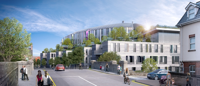
The NPHDB has set the challenge of creating “one of the finest children’s hospitals in the world”. All hospital projects present a complex array of issues, but paediatric facilities pose a number of unique challenges because of the nature and age-range of the patients and the close participation of their extended families. Children are particularly sensitive to the quality of their surroundings, so design considerations to do with colour, light, scale, views and landscape, which are important in all buildings, are doubly so in a children’s hospital. All of these design dimensions have been explored over the life of the project so far, and there has already been extensive consultation with patient, family and staff groups to harness their experiences and insights. On approaching the new hospital, the first impression will be of a ‘floating’ garden about halfway up the building, a ‘flying carpet’ of trees and plants, surrounding a curvaceous three-storey pavilion. There will be glimpses and sounds of life and activity in and around the garden, which give a tangible sense of this being a special place – a children’s and young person’s realm, elevated above the world of adults. Below the floating garden, the elements that will be distinguishable immediately are the main entrance, the outpatient clusters extending out towards the South Circular as a series of smaller scale ‘finger buildings’, and the Family Accommodation Unit, which forms the north side of a generous entrance piazza. On either side of the piazza wings project out like welcoming arms, drawing visitors towards the hospital’s front door. The curved form of the ward pavilion reveals itself most clearly above the main entrance, extending down to ground level as a double-height glazed screen, which allows the piazza and atrium to feel like an uninterrupted public space. Once inside, visitors will find themselves in what instinctively feels like the heart of the hospital – a four-storey high space that visually connects all the building’s principal levels. Two key features will orientate people: the ‘Biome’ and ‘Concourse’. With the main bank of public lifts at its centre, the Biome is the focus of vertical public movement – a structure reminiscent of botanical gardens, which introduces daylight and glimpses of the floating garden. The Concourse includes a lower ground level, providing access to a number of clinical areas as well as the main visitor car park situated on two basement levels below the building, so that pools of light guide people intuitively from their car towards lifts and stairs and on to their ultimate destination as directly as possible. On the west side of the Concourse, the outpatient clusters are grouped on two storeys within the finger buildings. The clusters are arranged around five garden courtyards. Reception and waiting areas are placed between the fingers, open to the Concourse on one side and the gardens on the other. The oval-shaped rooftop garden, a modern reinterpretation of the courtyard at the heart of the nearby former Royal Hospital at Kilmainham, is arranged in two halves either side of the Biome, forming a secure, sheltered environment for ten of the hospital’s 13 wards. The building is organised vertically in four zones, which are clearly discernible externally: • facilities management spaces and horizontal distribution, together with plant rooms and two levels of car parking (basements B01 and B02); • outpatients, and diagnostic and treatment areas (four floors from lower ground floor to level 02); • interstitial floor, accommodating plant rooms and administration/non-clinical space (level 03); and • wards (levels 04-06). The three zones visible above ground are clearly articulated in the building’s exterior form as: the stone-clad podium, the interstitial level carrying the ‘floating garden’, and the oval pavilion. This articulation is helpful externally in breaking down the hospital’s mass while, internally, it reinforces the logic of clinical adjacencies and makes the hospital’s layout more legible and easier to navigate. The bedrooms are arranged as two virtually uninterrupted ribbons around the four-ward oval. This, together with the two ward corridors, provides multiple options for grouping of patients and providing independent access to different parts of the floor. Externally, the four wards will be individually legible as distinct forms, curving both in plan and roof profile. Within this larger-scale order the individual eight-bed clusters appear as neighbouring ‘houses’, articulated externally by indentations in the façade formed by balcony recesses. These occur at regular intervals to coincide with social areas and play space within the wards, providing external space for those on the uppermost ward levels.
Completion: 2020
View projectHealthcare
New Karolinska Solna
Stockholmvägen 22, 761 43 Norrtälje, Sweden
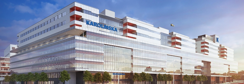
The remit of the new university hospital, which will open its doors to the first patients at the end of 2016, is to provide highly specialised healthcare and conduct basic research, patient-focused clinical research and education. Greater collaboration between healthcare and research will contribute to quickening the process for new research findings being developed into new treatment methods and medicines. The guiding principle is ‘the patient always first’, where the patient’s safety, integrity and comfort are at the centre. Patients will experience a state-of-the-art hospital, where planning and design have always been based on what will be best for them. For example, all in-patient rooms will be single rooms with a shower and toilet, and a bed for relatives to spend the night. At the A&E department, patients will arrive by ambulance, helicopter or by referral from another care provider – for example, primary care. In addition, patients who are already under treatment at the NKS will be able to come directly to the hospital. The New Karolinska Solna will be considerably more condensed than today’s Karolinska, where many buildings and activities are quite spread out. The NKS will be created with close links between the reception, the care units, imaging, laboratories, and surgical devices, for example. Close relationships and effective transportation and logistics will also be forged between the care and research facilities, both within the New Karolinska University Hospital and directly relating to the Karolinska Institutet. The NKS will be part of the future care system, which is based on all parts of the system interacting with each other. The demanding, highly specialised care at the NKS is complemented by extended emergency hospitals and specialist care outside the emergency hospitals. Information services, such as the Care Guide (Vårdguiden) and communication between patients and care providers, will lead to more efficient care of the patient’s actual needs. The NKS’ most important characteristics are: • a distinct focus on patient safety and integrity; • secure single rooms (with shower and toilet), with room for relatives to spend the night; • emphasis on minimising the movement of patients, by deploying efficient work methods; • good interaction and smooth flows between different units; • clear linkage between care, research and training, in order to develop the care services; • a purpose-built environment that supports healing and stimulates patients and staff; • a strong focus on energy efficiency and sustainability; and • a hospital in the city – state-of-the-art and close to the city’s inhabitants. The County Council’s Culture Administration leads the work on artistic design for the New Karolinska Solna project – the single largest ever art project for a public environment in Sweden. The art programme encompasses artworks that are integrated with the buildings, and completed works that can be moved (eg paintings and sculptures). Art will be everywhere: inside and outside, in staff areas and care environments, in stairwells and in waiting rooms. The artworks at the new hospital will interact with the architecture and interior decoration, and contribute to a visually attractive environment for the hospital as a whole. It is also an important element in creating a good care environment. Recent scientific studies have shown that art can have a positive influence on rehabilitation and other care processes. However, it must also be art in its own right and bring a humanistic, aesthetic and poetic dimension to its surroundings.
Completion: 2018
View projectWomen & children's
Das Neue Hauner (Parent-Child Centre of the University Hospital Munich)
Lindwurmstraße 2A, 80337 München, Germany

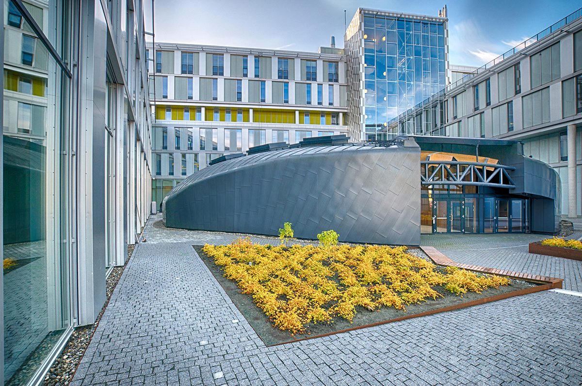
At the New Hauner, children, young people, parents, new mothers and staff will find a world of play and work interspersed with green islands within the building’s clearly defined boundaries, which are aligned with the structure of the surrounding Grosshadern campus. The New Hauner will be integrated into the park landscape of the campus. The design concept picks up this reference to the green surroundings and continues it on the inside. Patients, visitors and staff will feel this as soon as they enter the building. They will be met by a green courtyard and can take time, while passing through, to engage with the building and the new environment before entering the actual reception area. The first impression of the building will thus be positive and help dispel any anxieties associated with a hospital stay. The totality of the three-storey building will be broken up into small elements by the round, softly shaped courtyards. Each of these green islands has an individual form. Small interior environments with their own character surround each island. The interiors are easily recognisable, assisting orientation and identification with the particular “island environment”, and offering young patients, parents and women surroundings flooded with daylight. Despite the tight, operationally optimised linkage of functional areas in the New Hauner, the final outcome is a vibrant and varied building landscape. An opportunity to spend time in the open air, amid greenery, is always available for all users of the hospital – and without any need for them to leave the building. In addition, the central foyer provides open access to the patient garden.
Completion: 2022
View projectOrganisations involved


